Seerat Medak Launches Brand Identity for the Future
- News Desk

- Aug 20, 2025
- 3 min read
Updated: Aug 20, 2025

As Seerat steps forward into its next chapter, the brand has revealed a complete design system that defines how it will be seen, recognised and remembered. More than a visual refresh, this framework establishes Seerat’s foundation as rooted in timeless values, prepared to scale with consistency and purpose.
More than just a new look, the updated identity reflects the very meaning of the Seerat while providing a professional foundation for the future. Every element, from the logo and colours to typography, imagery, and tone of voice, has been carefully considered to create a brand that is modern, elegant and timeless.

At the heart of the new identity is the Seerat logo, designed to remain powerful and consistent across every medium. Rules have been established to protect its clarity, such as maintaining sufficient clear space around it, keeping it at readable minimum sizes in both print and digital, and restricting any distortion or misuse. Whether used in its primary black form on light backgrounds, reversed in white on darker fields, or in simple monochrome when necessary, the logo is now anchored as the central emblem of the Seerat.


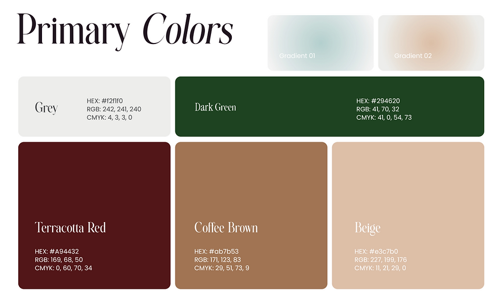
The colour palette has also been refined to balance elegance with versatility. Black and white form the core of the system, supported by a series of secondary shades including deep charcoal grey, soft beige, and a subtle accent gold. These tones create a look that is both modern and sophisticated, with the precision of defined codes ensuring that the colours appear consistent across digital platforms, printed material, packaging, and campaigns.
Typography plays a central role in shaping Seerat’s voice. The chosen typefaces, JUST Sans for bold, clear headlines and Things for body text and longer content, were selected for their modern feel and high legibility. This pairing ensures that whether someone encounters the brand on Instagram, a website, or a physical label, the voice of Seerat feels confident, professional, and easy to read.

Equally important is the imagery and graphic system. Seerat’s photography is designed to be authentic and human, using natural light and simple, neutral tones. Rather than polished, artificial visuals, the focus is on capturing moments and stories that resonate with real people. Supporting graphics such as icons and patterns are deliberately minimal, ensuring that they complement rather than distract from the narrative.

The tone of voice is another essential part of the brand system. Seerat communicates with clarity, warmth and confidence, aiming to be professional without ever feeling distant. The language is direct and human, designed to inspire trust and connection. In practice, this means avoiding jargon or unnecessary complexity and instead favouring words that are simple yet powerful, words that echo Seerat’s role as a brand built on stories and journeys.

Rolling out this refreshed identity will be a gradual process. Over the coming months, it will appear across digital platforms, social media channels, marketing materials, product packaging, and collaborative projects. For Seerat, this is not only about looking good but about being consistent and recognisable everywhere the brand shows up.
In building this framework, Seerat has anchored itself in simplicity and elegance while preparing for scale. By defining every element of its identity today, the brand is setting itself up for growth tomorrow. The refresh is not just a reflection of where Seerat is now but of where it intends to go, towards becoming a brand that is trusted, recognised and loved.
Welcome to Seerat. Your journey begins here.


